Readability
Readability is a content and format element that is improved when factors including audience, coherence, consistency and detail are considered (Bullemer and Hajdukiewicz, 2004).
Guideline 1: Reading Level
Common practice is for procedures to be written at as low a reading level as is practicable without compromising the intent of the procedure.
Support
Poor procedure readability is related to perceived poor procedure quality. This can result in a greater number of incidents/near-misses, procedure deviations, and neglection of written procedures (CCPS, 1996).
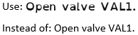
Example
Use: "Turn the valve one complete rotation."
Instead of: "Rotate the valve around its center of gravity so that each outer point on the valve is rotated two radians."
Instead of: "Rotate the valve around its center of gravity so that each outer point on the valve is rotated two radians."
Guideline 2: Procedure Step Numbering
Procedure steps with a required sequence of performance should be numbered consistently and consecutively. Common practice is for steps without a required performance sequence to be bulleted.
Support
Numbered steps help workers maintain their place within a procedure and increase step recollection (Lorch & Chen, 1986; Van der Meij and Gellevij, 2004).
Example
For steps with a required performance sequence:
Step 1 - Open valve V-01
Step 2 - Check level gauge light L-01
Step 3 - Monitor level gauge L-01
For steps without a required performance sequence:
- Open valve V-01
- Check level gauge light L-01
- Monitor level gauge L-01
Step 1 - Open valve V-01
Step 2 - Check level gauge light L-01
Step 3 - Monitor level gauge L-01
For steps without a required performance sequence:
- Open valve V-01
- Check level gauge light L-01
- Monitor level gauge L-01
Guideline 3: Procedure Font Size
Use a font size of at least 12 pt for all procedures. If those with vision impairments will use the procedures, use 18 pt font.

Support
Using at least a 12 pt font increases the readability and legibility of the procedure’s text (Russell-Minda, et al., 2007). Large print type should be used, preferably 18 pt but at a minimum 16 pt, for those with vision impairments (American Foundation for the Blind, 2018).
Example
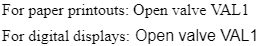
Guideline 4: Procedure Font Style
Use serif fonts (Times New Roman, Courier New, or Garamond) for paper presentation and san serif (Arial, Helvetica, or Verdana) fonts for electronic presentation.
Support
Readers are slightly better at reading text presented in a sans serif font on electronic displays (Russell-Minda, et al., 2007; Moret-Tatay, Perea, 2011) whereas serif fonts are better for printed materials (Gasser, Boeke, Haffernan, and Tan, 2005).
Example
Guideline 5: Font for Users with Dyslexia
Recent research has shown that the Open Dyslexic font can more effectively convey information to users with dyslexia than other types of fonts.
Support
The Open Dyslexic font has been shown to mitigate some of the common reading errors caused by dyslexia (Gonzalez, 2011).
Example