Hazard Statement Format

The format in which hazard information is presented affects the likelihood that workers will comply with the information (Hendricks, et al., 2018).

Improperly designed hazard statements may lead to worker confusion, resulting in workers not finding them useful because they are difficult to follow (Embrey, 1999).

Hazard statements should be designed in such a way as to stand out from other procedure steps (Hendricks, et al., 2018).
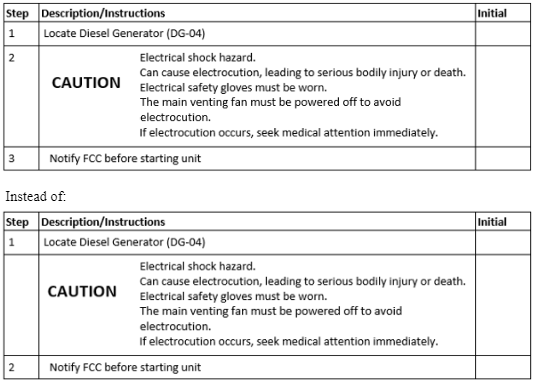
Guideline 1: Hazard Statement Placement
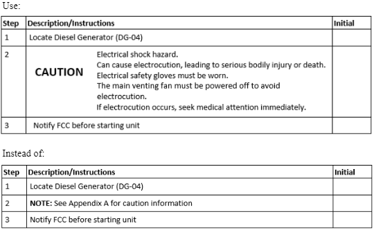
Common practice is for hazards, consequences, and prevention strategies applicable throughout the procedure to be presented immediately before the procedure steps, rather than in an appendix. Furthermore, precautionary information relevant to certain steps is placed directly before those steps.

Support
When precautionary information is presented directly before the relevant step(s), workers are more likely to comply with the safety precautions (Erdinc, 2010).
Example
correct
Guideline 2: Numbering Hazard Statements
Number each hazard statement consistently and consecutively as if each were a step.

Support
Numbering hazard statements can improve attention to them but it never hinders attention to them (Hendricks et al., 2018).
Example
correct
Guideline 3: Borders for Hazard Statements
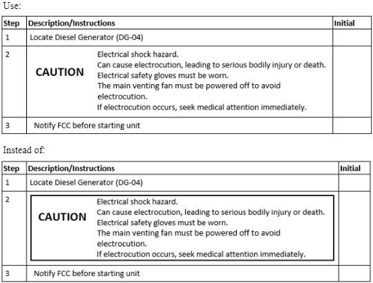
Borders around hazard information do not need to be used.

Support
Having borders around hazard statements does not reliably improve workers’ attention to them (Hendricks et al., 2018).
Example
correct
Guideline 4: Icon Use in Hazard Statements
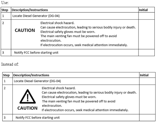
The use of hazard icons does not increase workers’ adherence to hazard statements, and can sometimes decrease adherence. Thus, hazard icons should not be used with hazard statements.

Support
The use of icons with hazard statements has been shown to result in decreased compliance with hazard statements (Hendricks et al., 2018).
Example
correct
Guideline 5: Shading for Hazard Statements
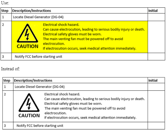
When hazard pictograms are used, the hazard statement should be shaded using a color that contrasts the font color.

Support
Shading hazard statements containing pictograms has been shown to increase compliance with them (Hendricks et al., 2018).
Example
correct